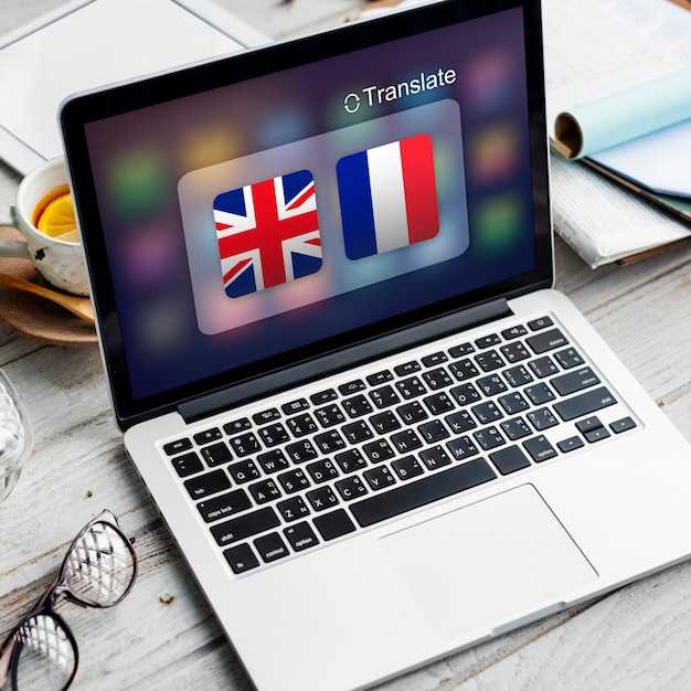

Audit UI strings and assets now, then build a one-pager plan for localization. Inventory all strings, graphics, and flows, and map each text to its localized variant. Align selection controls, button labels, and images so you can forecast effects on user tasks and set realistic milestones.
Define a multilingual style guide that covers typography, including serif options, and layout behavior across scripts. Specify line lengths, typography scales, and graphics usage rules. A clear standard helps show consistency and reduces rework as you add locales.
Separate content from code and use resource files for strings, image assets, and mockups that can be updated without touching production code. Treatment of animated elements and created assets ensures translations stay aligned. Keep continuous delivery in mind so translations arrive with features, and align efforts with product milestones.
Test with real users in context by validating UI in multiple locales, verifying that selection options and graphics render correctly. Use a complete checklist and collect feedback to refine the UI. Summarize progress in a one-pager to keep stakeholders aligned, and ensure you can allow local teams to contribute quickly.
Maintain and evolve the localization strategy for new locales. Plan for image assets and graphics updates that match brand voice, and establish a cadence to build and re-validate translations. With mind on context, you’ll arrive at a cohesive UI across regions while making updates smoother and more effective, minimizing costly rework and ensuring continued efforts pay off.
UI Localization and Readability: A Practical Plan
Start with a readability audit before localizing UI to set a baseline for all languages. The introduction should capture needs, audience and experiences, then map every on-screen string to its context. This invisible layer often hides placeholders and dynamic content that affect readability once translated.
Define a detailed specifications sheet that includes max line length, truncation rules, and expansion allowances. Using this framework, export strings in a translator-friendly format and preserve placeholders and information. For indesign workflows, align typography and spacing to the localization grid so exported text preserves layout fidelity.
Implement a practical editing cycle that balances clarity with brevity. Lets assign a bilingual reviewer for each language and run a quick readability test on key screens. youll see how terminology varies by language; hows the application of rules changes with context. Those steps help, and youre able to adapt in real time.
Designing for readability means applying core principles: concise labeling, consistent verbs, and visible feedback. Both native readers and non-native users benefit from straightforward phrases, short buttons, and well-spaced UI. Temptation to shorten labels can backfire, so resist it; using high-contrast colors and legible fonts. Use tests on real devices and verify with QA checks to ensure long strings do not overflow containers.
Communicate changes to your audience with detailed notes on needs and information impact. The audience relies on clear errors and guidance, so include inline help and context summaries. Observe effects on comprehension and task completion time after localization changes. By following this plan, products deliver consistent experiences across languages and markets, with measurable improvements in readability and user satisfaction.
Define Language Scope and Region Coverage
Set the core language scope for each region and lock it as the baseline for all UI projects. Use a data-driven option to visualize the selection and define concrete coverage targets for each market.
Analyze user data to determine multilingual needs: traffic by locale, device mix, and preferred formats. Build a short list of languages per region that balances reach and maintainability. Use a rule of thumb: core languages capture a high share of interactions; add secondary languages to improve coverage without bloating the UI.
Define a three-tier region coverage plan: core, extended, and optional. Core languages should cover around 80–85% of sessions, extended 10–12%, optional 3–5%. Adjust by data, not guesswork, and document what applies in each context.
Link language scope to personality: tailor copy and visuals to local context, preserving brand voice while respecting norms. This enhances understanding and builds trust with users across regions.
Practical workflow: in figma, map language variants on UI elements; use selection sets for typography, date formats, and RTL support. figma lets teammates visualize variants and compare layouts. Create preview scenes and link to tutorials for the team.
Testing and rollout: run linguistic reviews, automated checks, and manual testing using real data. Build a staged move to production with clear milestones. Gather feedback through connections with regional teams and adjust scope as data grows.
Documentation: maintain a context-rich scope doc that captures data, decisions, and exceptions to guide developers, testers, and content authors alike.
Contextualize Strings with Clear Placeholders
Use specific placeholders that reflect the data they stand for. Placeholders are usually short and to the point. Use a single word label for each placeholder, such as {user_name}, {order_number}, or {delivery_date}. Keep placeholders short, functional, and easy to translate across languages. This reduces translator drift and strengthens the impression.
Map placeholders with wireflow diagrams to show how text moves through interfaces. In your wireflow, place each placeholder near the relevant control and ensure it appears on both the label and the input prompt. This makes the context obvious before a translator touches the string. This also helps validate choices early in design and provides more context for translators.
Define options for dynamic values. Offer an option for a static fallback when data is missing. For each language, placeholders stay intact during translation; provide notes in the specifications. Include a free hint text that clarifies what the placeholder represents, for example 'Your {order_number} will appear here'.
Test thoroughly: check that the placeholder length fits the UI on smaller screens and renders correctly on click; verify alignment across interactive components; ensure the word choice remains natural; run checks with many languages.
Aside from the main copy, organize assets in a folder structure: base strings, placeholders, and per-language files. Build a living set of specifications that describe when to replace placeholders, how to format numbers/dates, and provide detailed guidelines for missing data handling. This approach saves time in localization projects and keeps business interfaces consistent with user expectations.
Plan Layouts for Text Expansion and Script Variants
Use a grid-based layout that anticipates text expansion across scripts. Implement a two-column grid on desktop that keeps anchors and labels in the left area and translated content in the right. Inside each module, let content wrap and grow vertically until it fits without overlapping controls or images, preserving a clear visual rhythm. Align related blocks using consistent gutters to support reading flow across screens and connect related sections.
Anchor visuals to maintain alignment: dedicate a visual region with a fixed aspect ratio that scales with the text, including a reserved image slot inside the grid to avoid content jumps. This approach visualizes how translations affect the layout and helps designers iterate with fewer surprises on apps and screens. This method gives designers a predictable baseline for iteration and allows you to test further refinements.
Plan the content inventory and workflows: map every string to a UI region (title, body, CTA) and tag with language-specific variants. Use translated tokens that fit within a single grid area and maintain a high-level structure; ensures the layout remains stable when strings expand. Tools and components from your digital design system support implemented patterns.
Testing protocol: run a strings expansion test on real devices, measure line counts, vertical growth, and scroll length per language. On desktop, reserve 20–40% additional height for longer translations; on mobile, plan for 30–60% growth. Use a visual checklist: anchors retain position, grids stay aligned, interactive states remain accessible after expansion; include click targets.
Implementation tips for designers and developers: build responsive components that keep inside the same content flow, use CSS grid with clear anchors, define spacing tokens, and keep a final set of guidelines to review before release. Since translations vary, rely on simulated translated strings during thinking and planning to visualize potential issues; then iterate until the final UI holds up across screens.
Build a Central Glossary and Style Guide for Consistency
Build a central glossary and style guide in your repository, and export them to crowdin to align every line across languages. This hub clarifies terms, tones, and UI conventions, reducing drift as teams interact with their texts on different devices.
Place the glossary here in your shared workspace and link it to figma and crowdin so translators and designers can quickly reference terms.
- Define core terms with definitions, preferred translations, and usage notes. Keep them in a single glossary file and export to crowdin to keep texts aligned across locales.
- Attach a style guide that covers capitalization, punctuation, numbers, dates, and UI labels. Map each entry to the exact line in the UI so the texts stay usable on different devices and locales.
- Collaborate across teams: product managers, designers, and localization specialists. lets them directly contribute, review, and approve changes; use the integration to show previews in the beta channel before the final.
- Integrate assets and visuals: store photo references and simple graphics alongside terms to illustrate usage; link these to your figma components and text tokens for consistency.
- Establish a fast update loop: when new terms arrive, theyre added to the glossary and style guide; export to crowdin, preview changes, and publish the final content steadily.
Its importance lies in reducing rework, improving usability, and keeping the brand voice intact across languages.
Because terminology drift slows releases, the glossary acts as a single source of truth for their texts across boards. Measure success by how quickly teams interact with the glossary and how clearly it guides line-level UI texts across devices and contexts.
Test Readability with Real Screens and User Scenarios
Start with three focused tests on real screens: locate a headline, scan a description, and complete a purchase step. Use simple rules: font size 16px, line height 1.5, and color contrast at least 4.5:1. Keep lines under 70 characters and avoid translations that expand text by more than 15%. If wrapping breaks, fix layout instead of shrinking text, so information stays legible. Use a tool to measure reading speed and accuracy, and track where objects in the UI slow users down.
Pair this with quick tutorials to guide peers through user tasks. Observe behaviors as users switch languages, and allow participants to click, scroll, and type naturally. Capture what causes confusion and learn from the feedback. Record information about when color cues mislead and why the tone of copy matters.
Use prototyping to test different string lengths and color schemes. Create 2-3 variants and paste translations into the interface to compare results in real scenes. When you paste translations, observe how long text wraps and where it spills. If something looks off, adjust padding or line breaks; avoid useless padding and test across different devices. Focus on objects like buttons, inputs, and menus; ensure actions remain obvious. Explore different layouts and functions to support fast prototyping.
Track speed and comprehension with concrete metrics: reading time per screen, accuracy of meaning, task success rate, and time spent on fixing things in the codebase. Steadily compare the before/after results and use the data to advance the localization strategy. thats why you want to align color, typography, and spacing to the brand personality.
Finalize with clear next steps: consolidate findings into a language-ready style guide, assign owners to fix color, margins, and typography across the codebase, and set up a regular readability review. Use tutorials for ongoing education and keep a living prototyping library that reflects your creative personality. By following these steps, you keep the UI readable across different contexts and speed up the localization workflow.