Recommendation: start with a one-page Brand Core that defines your tone, value proposition, and the visuals you use to evoke emotion. This concise guide makes internal teams aligned and helps you maintain coherence across every channel and everywhere. Rather than juggling dozens of interpretations, use this single source of truth to guide every asset, then run new materials against the Brand Core to break ambiguity and keep messaging consistent.
Data from testing shows the payoff: brands applying a single Brand Core boost recall by 18% and slash asset production time by around 30% on ongoing campaigns. In 3–5 asset cycles, teams that maintain a shared language avoided 60% of last-minute edits, saving hours per week. This effect is visible across product pages, social posts, and packaging. Short cycles speed reviews and shorten cycle time even further.
To apply this in practice, a Brand Core combines visuals and copy into a two-part system: a Brand Core plus a set of guardrails. Step 1: define your three brand pillars; Step 2: write tone examples; Step 3: assemble templates for headlines, captions, and logos; Step 4: create a quick review checklist; Step 5: train teams with bite-size sessions. When you publish, maintain consistency even during changes, because creativity thrives when the rules are clear and beyond the logo. A playful note: avoid pirouetting logos that distract from the core identity; the guardrails keep visuals correct and aligned. This approach combines discipline with creativity and can be rolled out everywhere.
Real-world examples show how teams sustain brand coherence without dulling creativity. A consumer-packaged goods group uses a one-page spec that links color, typography, imagery, and copy blocks; a tech vendor updates product pages and support articles with the same guardrails, so changes in one area do not derail others. If a design task feels risky, answer: what do we want to evoke and how will this look across assets, then verify with a quick two-question check: does it align with the Brand Core, and does it feel like our voice? When you keep the guardrails uniform, you reduce issues, avoid misalignment, correct inaccuracies, and support a consistent perception that customers want to trust. This approach helps ensure fewer errors during handoffs. The result: teams report a 40% faster handoff between creative and product teams and 25% fewer revision cycles.
Audit Brand Touchpoints to Identify Channel Drift and Gaps
Start by auditing all brand touchpoints across channels using a single standardized form to identify drift and gaps. Audit the entire customer journey from awareness to post-purchase, and make drift visible by scoring each touchpoint on consistency, clarity, and impact.
Build a comprehensive touchpoint map and a clear list of review targets. Include online and offline channels such as website, mobile app, emails, social profiles, ads, packaging, in-store signage, packaging, call center scripts, and live events. For each item, compare against the model you want to maintain and flag any break in alignment.
- Website and mobile app: verify the signature look–logo placement, color palette, typography, imagery–along with the sizing of UI elements and the readability of forms and CTAs.
- Emails and CRM: check subject lines, sender signatures, and the cadence of communications; confirm the voice remains consistent with the brand’s tone.
- Social profiles: ensure consistent avatar usage, bio language, link destinations, and post style that reflect the same values across platforms.
- Packaging and in-store: align packaging visuals, color codes, typography, and shelf messaging with digital experiences to avoid disconnect.
- Call center and support: standardize scripts, escalation paths, and knowledge base references to prevent inconsistent experiences.
- Advertising and events: apply the same design system and messaging framework across all assets and activations.
- Experiential channels: check signage, beacons, and staff interactions for a unified experience that reinforces the brand at every touchpoint.
Use a common scoring rubric to quantify drift, then generate a concise report. Include scoring for each touchpoint, the severity of gaps, and the potential impact on the customer journey. Remember to document who owns each fix and the expected close date.
Drive quick wins by targeting the most impactful gaps first. Focus on areas where the entire experience breaks down or where audiences encounter losing moments in the flow. Include sizing and layout fixes, CTA alignment, and consistent tone across channels to reduce friction and increase trust.
Draw on a few signature cues to unify disparate channels. For example, nikes demonstrates a crisp, minimal approach that travels well from site to store; replicate that approach with your own signature elements while honoring your brand’s core character, including any kinnari-inspired motifs or color tokens you use. Use these tokens to form a cohesive visual and verbal language across experiences.
After the audit, create an action plan with clear ownership. Include a refresher for teams to reinforce the approved standards, and schedule recurring refresh sessions to prevent drift. Include a quarterly review of touchpoints to ensure alignment and identify new gaps as channels evolve.
To maintain momentum, publish a concise set of guidelines and a living checklist. The checklist should cover every touchpoint, ensure down-to-earth sizing and accessibility, and include a call to action for teams to escalate issues early. This approach helps you increase consistency and maintain momentum across the entire brand ecosystem, while ensuring you’re always listening to feedback and adjusting quickly.
Define a Single Source of Truth with a Brand Playbook and Asset Repository
Begin with a living Brand Playbook and Asset Repository that acts as the single source of truth. This internal hub stores visuals, messaging guidelines, usage rules, and all assets in one place, so everyone–from marketing to product teams and external agencies–can act from one source and move faster than email threads. The playbook itself codifies the rules for quick decision-making.
Structure the system around three pillars: Brand Playbook (purpose, messaging, cues), Asset Repository (logos, templates, visuals, fonts, photography guidelines), and Governance (owners, approval workflows, versioning). Tag assets with metadata like campaign, format, language, rights, and sourcing to enable quick retrieval across websites and global campaigns everywhere. This ensures consistency where consumers interact with the brand and raises the perceived quality across the entire experience. However, balance guardrails with flexibility to adapt to local needs, and provide enough guardrails to guide behavior.
Key sections to include
Inside the Brand Playbook, define the thing: mission, values, and the cues that guide both visuals and copy. The Asset Repository should cover logos, typography tokens, color scales, photography style, icons, templates for ads, emails, and landing pages. Include examples that demonstrate correct usage, as well as learning notes on common pitfalls. Ensure internal visuals align with global standards before they show on websites, so the action feels cohesive everywhere and the experience of the consumers remains consistent.
Governance, adoption, and metrics
Assign active owners for maintaining the repository, enforce lightweight version control, and publish a change log so everyone can see what changed and why. Before publishing, run a quick check against the Brand Playbook to verify alignment; this reduces questions from consumers and helps maintain trust. Track usage metrics (assets opened per campaign, time saved sourcing, number of campaigns using approved templates) and lead quality changes to quantify impact. Use feedback cycles to refine cues and visuals; shows how the assets perform across websites and channels to prove the approach generates value for teams and agencies alike. The result is a focused, lean source of truth that lowers friction, and when everyone follows it, the entire ecosystem–from internal teams to global partners–benefits.
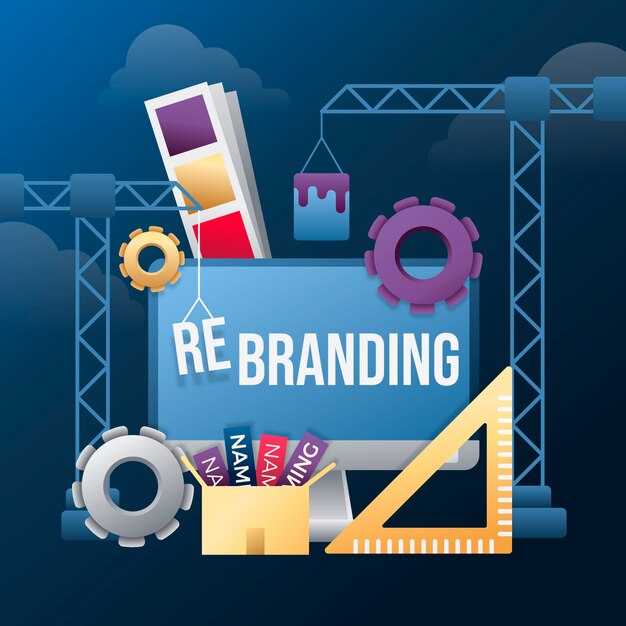
Standardize Visual Identity: Logo Rules, Color Palette, Typography, and Imagery
Adopt a single, documented standard for logo usage across all channels to create a seamless experience. Advocates within the company want every asset to reflect the same character and personality, so we codify logo rules, color, typography, and imagery in one living guide. This reduces posting errors, speeds up production, and strengthens trust with audiences.
Logo Rules and Clear Space: maintain a minimum clear space equal to the logo height on all sides, and never crowd the logo with other elements or text. Use only approved versions: full color on light backgrounds, white on dark surfaces, or a single-color version for monochrome applications. Minimum digital size is 28 px wide; minimum print width is 60 mm to preserve legibility. Ensure the logo never appears stretched, rotated, or distorted, and avoid placing it over busy patterns that compromise readability.
Color Palette and Usage: lock in a primary blue (#1A5DFF) for the logo and CTAs, a warm secondary (#FF6B00) for accents, and a cool accent (#00C2A8) for highlights. Neutral options (#111213, #FFFFFF, #8C8C8C) support text and backgrounds. Across materials, these colors should be used consistently, with contrast checked at 4.5:1 for accessible text on backgrounds. These rules keep assets cohesive everywhere, preventing ad hoc shifts that erode trust.
Typography System: designate two families–headings in Montserrat, body text in Inter or system-ui stacks (ui-sans-serif). Establish a clear hierarchy: H2 28–34 px, H3 22–28 px, body 16 px with 1.4 line height. Limit to two weights per family in a single layout to preserve clarity, and reserve bold for emphasis on key statements. These decisions reinforce the company’s voice and help audiences read quickly without distraction.
Imagery Style: select photography and illustration that feel bright, authentic, and uncluttered. Favor natural lighting, candid compositions, and people-centric scenes that convey collaboration and confidence. Avoid heavy filters, inconsistent aspect ratios, or imagery that appears forced. Images should embody the brand personality and represent real scenarios, not generic stock vibes. Ensure every asset remains legible when overlaid with text or icons.
Process and Resources: conduct a quarterly review cycle to audit assets, styles, and postings. The review should include a quick checklist: logo usage, color balance, typography pairing, and imagery alignment with brand values. Maintain an accessible assets library and a single source of truth so contributors can trust what to reuse. These resources reduce friction and keep teams aligned across departments; ash ar leads the initiative with clear ownership and accountable timelines. Conducting this process prevents losing momentum and keeps the brand coherent, everywhere from internal decks to external campaigns.
Examples and Guidelines: these examples illustrate correct versus incorrect applications of logo, color, typography, and imagery. By following them, teams can avoid inconsistent appearances that dilute opinion or confuse audiences. When in doubt, refer back to the guidelines and consult the assets team; cannot stress enough that consistency builds trust and speeds execution. The goal is memorable experiences that represent the company well and support a strong, unified voice across channels.
Unify Messaging: Tone, Value Propositions, Taglines, and Copy Templates
Choose a single, audience-focused voice and apply it across all channels to ensure consistent messaging from email to paid social. Build a practical framework that links tone, value propositions, taglines, and copy templates, so every touchpoint offers a coherent story.
Discover where messages diverge across platforms and align tone, color, and value with each context. Create copy templates that stay consistent yet adaptable, so headlines and calls to action feel familiar even when formats change.
Audit content to identify inconsistencies across 60 messages on four platforms, and map them to standardized guidelines. Let trends and user feedback drive revisions, and set a planning cadence for quarterly refreshes to keep assets aligned.
Build a copy toolkit: a framework with behind-the-scenes intent, codes, and tools that enforce consistency. Use a tagline roster that states the offer and the benefit, and create templates that combine tone with concrete benefits, proof, and a clear next step. Think of nikes as a cue for crisp, confident messaging–short lines, punchy verbs, and color cues that appear bold on mobile and refined on desktop. This approach helps understanding and creativity to win across lifestyle categories. Ensure the color palette is applied consistently, and plan content that appeals to bigger audiences without feeling generic.
Set Brand Governance: Decision Rights, Approval Workflows, and Change Logs
Assign clear decision rights for each asset type and publish a short, scannable matrix that lists owners, approvers, and escalation paths. This structure keeps teams aligned and reduces friction when assets move from creation to live publish.
- Decision Rights: Define owners for each asset category–logos and marks; color palette and typography; templates and copy blocks; packaging and signage; partner co-branding; and localization assets for markets. Keep roles named in a single, visible roster so responsibility stands beyond any one team.
- RACI map: Build a simple Responsible, Accountable, Consulted, Informed matrix per asset type. Ensure the accountable person can sign off on changes, which matter when scope shifts or issues arise.
- Monthly cadence: Schedule a recurring review with employees across Marketing, Product, Legal, and Sourcing to verify ownership, update expectations, and capture changes in asset life. This fosters alignment without losing context and prevents drift beyond the brand rules.
- Name and life of assets: Attach a clear name to each asset and maintain a predictable lifecycle so nothing is lost during a month of work or a long sourcing cycle with partners.
- Kinnari governance role: Assign kinnari as governance lead for day-to-day decisions, ensuring consistent interpretation of guidelines across teams and partners.
Approval Workflows
- Submit requests via Brand Portal with a concise summary, asset name, changes requested, and rationale. Attach proofs or brand references to speed review and reduce back-and-forth.
- Brand review for consistency: verify alignment with the structure, tone, and visual standards; flag deviations and request revisions before proceeding.
- Legal and regulatory checks: confirm names, claims, and co-branding do not introduce risk; loop a compliance owner or translation team for localization if needed.
- Final approval: the Accountable owner or designated approver signs off; once approved, move to publish or live status within 24–72 hours depending on risk level.
- Publish and monitor: publish assets to live sites or DAM with versioned IDs and a changelog entry automatically linked to the asset record.
Change Logs
- Template fields: id, asset name, version, date, author, owner, change description, reason, impact, status, publish date, and link to diffs or screenshots.
- Capture every change: minor edits to copy or color value updates belong here; major overhauls or new co-branding require formal approval and a fresh version.
- Versioning discipline: increment major/minor numbers; keep previous versions accessible in the archive for reference with a month-based retention policy.
- Audit trail: store approvals, comments, and rationale to help resolve issues without losing context.
- Review cadence: run a monthly review of past changes, verify that all live assets reflect the approved version, and surface any lingering issues.
Practical tips and examples
- Seamless requests: use a standard form in the Brand Portal; this speeds publish and reduces rework, which helps life across teams and partners.
- Single source of truth: connect a DAM and Brand Portal to the change log so employees and partners see the same version at publish time.
- Impact rubric: classify changes as minor, moderate, or major; assign required approvals accordingly, which probably saves time on low‑risk edits.
- Training and tips: provide short monthly tips for employees on how to navigate governance tools and keep a living glossary for name conventions and assets.
- Sourcing and partners: require external contributors to use approved assets and follow governance rules to prevent issues beyond internal teams.
- Tools and philosophy: view the governance toolkit as a weapon against drift, not as a hurdle; show how each tool supports structure and life of the brand.
- Examples in practice: for a logo update, publish a changelog entry, update the asset's name, and send a brief showing the before/after visuals to all stakeholders.
- Tips for speed: keep a short list of pre-approved changes that skip secondary reviews when impact is clearly within guidelines.
Cadence and accountability
- Month‑end reviews: a compact check of all live assets, recent changes, and upcoming approvals to ensure no drift occurs in the coming month.
- Roles review: rotate or refresh the ownership roster quarterly so responsibilities stay clear and employees understand their part in maintaining quality.
- Education for partners: share governance briefs with external agencies and vendors to align expectations from the start.
Scale Adoption: Training, Onboarding, and Real-World Application
Begin with a 6-week, modular program that ties learning to final outputs and client workflows. Map each module to a part of daily tasks so teams apply what they learn immediately, reducing inconsistencies across teams. Build a shared hub for resources and ensure all modules reference the same visual guidelines, templates, and image assets. If youre leading a team, this structure makes scaling adoption smoother.
Adhere to a practical, hands-on approach: conduct training in short, focused sessions and reinforce with concrete tasks. Conducting micro-assessments weekly reveals gaps early. Make sure every asset, template, and guideline adheres to the brand styles, and adhere to guidelines across teams. Carefully monitor feedback and adjust content to keep it relevant. This makes adoption easier and outcomes more consistent.
Part of onboarding is provisioning access to a ready-to-use kit: a video library, checklists, sample projects, and a sourcing list of approved assets. Use inputs from cross-functional teams so content used reflects real work. Never rely on a single source; combine docs, live demonstrations, and on-the-job assignments to boost retention and relevance. Saying that customers saying they value clear artifacts is common and worth addressing through practical artifacts.
Make daily work reflect what teams learned: assign a mentor, set expectations for applying new styles, and track progress with clear metrics. Regularly review outcomes with customers and internal stakeholders to adjust content. The final aim is to cut time to value while keeping visuals, process steps, and language consistently aligned.
Strukturierter Trainingspfad
Design a four-module path: Brand Alignment, Asset Stewardship, Interaction Scripts, and Real-World Scenarios. Each module uses short, practical tasks, a quick-start guide, and a checklist that can be completed in under an hour. After each module, conduct a 5-question checkpoint and a hands-on task that produces a tangible artifact. Track completion, task quality, and impact in a shared table to highlight progress and areas needing coaching.
| Phase | Duration | Focus | Metrics |
|---|---|---|---|
| Training | 2 weeks | Brand alignment and visuals | Inconsistencies reduced by 40%; assets used rate 90% |
| Onboarding | 1 week | Templates & guidelines | Adherence rate 95%; time per task reduced by 15% |
| Real-World Checks | 3 weeks | Live Aufgaben | Kundenfeedback-Wert > 4,5/5; Endausgaben bestehen die Qualitätsprüfung |
Onboarding Toolkit und Real-World Checks
Während der Einarbeitung ein kompaktes Toolkit bereitstellen: Vorlagen für E-Mails, eine visuelle Referenzkarte und eine Reihe von Nutzungstipps. Verwenden Sie Visualisierungen, die zum Markenbild passen, und stellen Sie sicher, dass die Inhalte über alle Kanäle hinweg konsistent erscheinen. Fügen Sie eine Ressourcenliste hinzu, die auf zugelassene Assets und Schriftarten verweist. Aktualisieren Sie das Toolkit regelmäßig auf der Grundlage des Teamfeedbacks; dies hält die Inhalte praxisnah und relevant.
Um den Schwung aufrechtzuerhalten, sollten wöchentliche Briefings mit Teamleitern geplant werden, um den Fortschritt zu überprüfen, Erkenntnisse festzuhalten und Inhalte anzupassen. Konzentrieren Sie sich auf messbare Ergebnisse: weniger Inkonsistenzen, schnellere Erledigung von Aufgaben und höhere Zufriedenheit von Kunden und internen Teams. Indem Sie sich auf umsetzbare Schritte und leicht verfügbare Ressourcen konzentrieren, vermeiden Sie nutzloses, verstreutes Engagement und erhalten den Schwung.
Fortschritt verfolgen: Metriken, Dashboards und regelmäßige Überprüfungen zur Aufrechterhaltung der Konsistenz
Key Metrics for Brand Consistency
Richten Sie eine freundliche, dreiteilige Wertungskarte ein, die Identität, Marktsignale und die Leistung von Partnern mit einem gemeinsamen Ziel verknüpft. Dieser umsetzbare Rahmen erfordert Planung, umfasst Audits von Beschaffungsnetzwerken und integriert Kontrollpunkte für die Endergebnisse. Er stützt sich nicht auf Vermutungen und demonstriert Wert über alle Dienstleistungen hinweg und hält gleichzeitig die Teams auf Kurs. Danach wird es zu einer zuverlässigen Grundlage, die Teams in verschiedenen Regionen und Märkten wiederverwenden können.
Zu verfolgende Metriken umfassen Identitätskonsistenz-Scores, Marktreichweite, Kundenstimmungen und Partnerzusammenarbeit. Ein einzelnes Dashboard zeigt Fortschritte und ermöglicht es anderen, die Daten einzusehen. Es zeigt, wie jeder Bereich zum Wert und zur Servicequalität beiträgt, und dieser einheitliche Rahmen hält die Planung abgestimmt. Dies erleichtert es Managern, Erkenntnisse in praktische Maßnahmen über Sourcing-Netzwerke und Partnerservices zu übersetzen. Ein weiterer Datenpunkt kann verwendet werden, um Kanäle zu vergleichen.
Cadence, Reviews und Maßnahmen
Cadenz und Überprüfungen: Nach jedem Zyklus interne Audits und externe Prüfungen mit Partnern und Lieferanten durchführen. Die Überprüfung informiert über Aktualisierungen des Plans und treibt abschließende Änderungen in den nächsten Zyklus voran.
Wertlieferung und Serviceverbesserungen verfolgen und messen, ob Entscheidungen den Beschaffungsprozess für Netzwerke und Kunden vereinfachen. Freundliche Einstellungen stets beibehalten, auf gemeinsame Ziele fokussiert bleiben und kontinuierlich Verbesserungen für die nächste Runde der Planung und Ausführung suchen.


